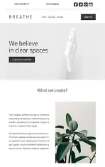
The EmailBuilder™ is an email editor designed by Mailify Software in order to simplify the task of creating emails and newsletters.
The ease of use of the EmailBuilder is based on the fact that you do not need technical skills in HTML or CSS to design a responsive and effective email campaign.
A simple game of drag & drop allows you to add your content, text and images, and format them effortlessly. Everything is customizable: graphic style, colors, spaces, borders, typography.
Access to the EmailBuilder | Creative modes | Templates | Dashboard | General settings
Blocks | Contents | Styles | Images editor | Web copy | Unsubscribe | Reset
The EmailBuilder is available when you create an email campaign and select "EmailBuilder/Templates" in the "Creative mode" step.
Several modes of creation are available in Mailify Sunrise:
If you decide to opt for the EmailBuilder/Templates mode, you will have the choice of:
Assuming you choose to start from a Mailify template, a large number of 100% customizable and responsive design templates are available.
Choose the one that's right for you and customize it to your heart's content by adding your logo, images and brand colors to the EmailBuilder.
Whether you have chosen to start from an existing template, from a Mailify template, from a Smart Template, or from scratch, you are redirected to the "Editing" step. This is where you will be able to use the EmailBuilder and customize your email.
The editing screen is composed of 3 areas:
It is possible to increase the size of your dashboard in order to gain comfort of use.
Click this button, located at the top of the right pane to fold the pane. This action will be reversible by clicking this button again.
Click this button, located at the top right of your dashboard, to hide the left column and the header bar.
By default, the display mode of your dashboard is in "desktop" version, that is to say that you view your email as if it were consulted on a computer.
You can view the rendering of your "Smartphone" email version by clicking on the "Switch" button located above your dashboard
The general settings concern both the display of your work plan and the global settings of your email being edited.
You can change the general settings in the right pane:
Enable mobile version: show or hide the switch button at the top of your work plan This option is enabled by default If you do not want to display the mobile version of your email you can disable this option in the general settings.
NB : The inner margins ("cellpadding" attribute of your <Table> tag in HTML) are accessible in the properties of the columns composing your block. This option allows you to manage the spacing between your content and the borders of the block in which it is inserted (attribute "cellpadding" of your <Table> tag in HTML). This is also a parameter allowing you to gain readability, or on the contrary to condense your content. This spacing is managed in pixels.
Before inserting text or images into your email, you must insert a container to accommodate your content.
A block is a container.
Your email is based on an architecture of blocks hosting content (images, texts, etc.). It is important to create a coherent structure with a sequence of heterogeneous blocks. Try to find a balance between your blocks of text and your blocks of images, to facilitate the reading of your email.
To insert a block into your email, open the "Contents" section in the right pane. You will notice that this section is divided into 2 sections: blocks (containers) and contents.
They are 8 types of blocks:
The blocks you save make it easier to find blocks you've created from scratch and want to re-use in another campaign. Otherwise, you can always use predefined, standard blocks.
You can modify your structure by adding blocks by simply dragging and dropping to the place of your choice.
It is possible to manage the properties of each block independently of the other blocks: to do this, click on the "Properties" button on the toolbox that appears when you hover over the block concerned.
A window appears which allows you to customize the properties of the general block in the first tab and the properties of the columns in the second tab.
Thus for each block, you will be able to customize the following properties in the first tab of the properties panel :
You will be able to customize column properties via the second tab of the properties panel :
Warning: Not all of these properties are supported by all email clients. If you experience any issue with the display of your message in a mailbox, we invite you to read our dedicated article on this subject.
You can choose an image or a background color for your block.
If you choose an image, Mailify advises you to add a background color similar to that of your image, because some email providers (such as Microsoft Outlook) do not support image management. In this case, if you have text above your image, this text will only be visible if you have chosen a background color close enough to that of your image.
To choose a background image, click on the three dots icon next to the "Background image" field.
A window of your file explorer will open so you can select the image in the directory of your choice.
To choose a background color, click on the colored square next to "background color of the block":
A color picker appears, where you can choose a color directly by clicking on the spectrum displayed in the upper part of the selector.
If you want to choose a very specific color, you can type its references in the lower part of the color picker.
Mailify Sunrise accepts type references:
HEX: Hexadecimal
RGB: Red Green Blue
HSL: Hue Saturation Brightness
Scroll up and down to switch between color codes:
To change the background color of a specific column, go to the "Columns" tab of the properties panel, select the column of your choice and change the background color. The color change will only be done for the selected column.
This section is used to edit various properties of the borders of your block:
You can choose the color and the thickness of the border of your block.
It is possible to manage the settings of each border (top, bottom, left, right) of the block independently. To select a border and change the related settings, click on the representation of the border of your choice in the diagram available above the border properties.
On the diagram, all borders are selected by default. To select / deselect a border, simply click on it.
The selected borders appear in orange on the illustration. A border that is not selected will appear in white on the illustration.
By default, the borders of your block are set with a width of 0 pixels. Whatever color is selected, it is invisible on the screen.
If you want to assign a color to the border of your block, start by increasing the width of it.
Once you have increased the thickness of your border, you can color it with the color picker next to "Border Color".
To choose a color for your borders, click on the color picker on the left in the corresponding border settings section.
How this color picker works has been described here.
To change the thickness of your borders, change the number of pixels corresponding to the thickness of your border in the relevant field of the "Thickness" section.
By default, when you increase the thickness of a border, you increase the thickness of the other borders in the same way. You can manage independently the thickness of each border of your block (top, bottom, left and right border) by selecting the border(s) of your choice in the diagram available above the border properties.
As a reminder, selected borders appear in orange and unselected borders appear in white.
Several styles are available for your borders:
Simple solid line borders
Dotted borders
Dashed borders
Double borders
To change the style, use the drop-down menu in the "Style" section of the border settings and choose the style you want.
You can independently manage the style of each border in your block (top, bottom, left and right border) by selecting the border(s) of your choice in the diagram available above the border settings.
It is also possible to manage the rounded corners of the borders of your block. To do so, you just have to enter the desired degree of rounding in the corresponding field in the "Radius" section of the border settings.
You can change the number of columns in a block at any time via the "Number of columns" setting.
To add a column, simply press "+ Add". To guarantee an optimal display on all types of reading media, the maximum number of columns is 4 per block.
To remove a column, simply press the cross symbol next to the column number.
The settings related to the spacing between columns allow you to manage the space around and between each column that makes up the block.
To edit the spacing between columns, click on the cogwheel symbol of the block and go to the "Column spacing" section in the "Block" tab and change the number of pixels in the corresponding field.
This property is not taken into account by all email clients.
This section allows you to display the block differently if the campaign is read on mobile.
You can decide whether or not to display the block by activating / deactivating the option "Display this block in the mobile version".
If you decide to display the block on the mobile version of your campaign, you can choose to display the columns next to each other as in the Email version or below each other. Choose the layout that matches your needs in the "Layout" section of the mobile version's settings.
Finally, once you have chosen the layout, you can change the order in which the columns appear via the "Display order" section. The column number corresponds to the original display order in the email version.
In this section of the settings, you can define a link for the whole block. By activating this option, your entire block will be clickable and will redirect to the link you have defined, except for the other links you have integrated in your content. This property is not taken into account by all email clients.
The properties of the block's columns are available via the tab named "Columns" in the block's property panel. You can manage the properties of each column of the block independently.
You can choose a background image or color for each column of your block.
To do this, go to the second tab "Columns" in the properties panel of your block and select the column for which you want to insert a background image or change the background color.
To add a background image or change the background color, the process is the same as for the block and has been described here.
This section allows you to edit various properties of your column borders:
It is possible to manage the properties of each border (top, bottom, left, right) of each column independently. To select a border and modify the related properties, click on the representation of the border of your choice in the diagram available above the border properties.
To change the color of the borders, follow the same procedure as for the borders of the block described here.
To change the thickness of the borders, follow the same procedure as for the borders of the block described here.
To change the style of the borders, follow the same procedure as for the borders of the block described here.
To change the radius of the borders, follow the same procedure as for the borders of the block described here.
This option concerns the inner margins of your columns.
You can independently manage the inner margins for each of your columns, and thus adjust the position of your content inside your blocks.
In the "2 columns" type block below (whose background is blue), the margins have been set differently for each of the two columns: the first column has a zero internal margin, while the second column has been set with a margin of 35 pixels.
The position of the contents of each column is therefore different inside the block:
Your margins can be managed in a uniform way (picto padlock locked) or independently (pictogram padlock unlocked), and this for each column of your block:
You can vertically align the contents of each column in your block with the vertical alignment settings.
You can choose to have your content at the top of the block, at the bottom of the block, or at its center.
This option is particularly useful when there are differences in the length of content between your different columns.
For example, when a text takes more space than the contents of your other columns:
So adjust the settings of your blocks as you see fit until you get the desired result.
In this section of the settings, you can define a link for the whole block. By activating this option, your entire block will be clickable and will redirect to the link you have defined, except for the other links you have integrated in your content. This property is not taken into account by all email clients.
If you have made a lot of settings, keep in mind that you can save your emailing, as a template, in order to keep the layout and to be able to use it again during a next creation.
If you have made a lot of settings, keep in mind that you can save your email, as a template, to preserve the formatting and to be able to use it again at a future creation.
You can perform several actions on a block, beyond managing the parameters associated with it as we have just seen:
1st click on "Swap contents":
2nd click on "Swap contents":
Content is something you can move in the columns of your blocks.
To move content, click on it and drag and drop it into the container of your choice.
There are 14 types of content available:
Image | Text | Space | Separator | Title | Button | Social networks | Sharing | RSS feed | Floating picture | Google Maps I Wordpress article I HTML code
This content allows you to insert an image into a container.
To insert this content, click on it and drag and drop it directly into one of the columns of the block of your choice. The container is highlighted when you are about to add your content to tell you that you can drop it there.
Once you've dropped it into a container, there are several things you can do about it when you hover over it:
Choosing an image also allows you to select an image
Browse: Allows you to select an image by browsing the files on your computer
Stock Images: Allows you to select a image from the free image bank of Mailify
From a URL: allows you to insert an image by inserting the hosting link of your image
Insert Variable: If your recipient list has an "image" column that lists links to images for each recipient, your image will be customized to each of your recipients. For example, imagine that your list contains the photo of the favorite product of each of your recipients, you will be able to display a different product image for each recipient who will receive your email.
Learn more about dynamic personalization fields.
You can then modify the dimensions of the image by adjusting the width and height (in pixels) of the image. A padlock pictogram allows you to manage the dimensions of your image while maintaining the initial proportions between height and width (locked padlock) or by managing these dimensions independently of each other (padlock unlocked).
We advise you to avoid stretching or compressing your image by changing the size of your image after unlocking the padlock. This will have the effect of deforming it and the aesthetic rendering will be degraded.
You can also manage the alignment of your image within the block in which it is embedded: Align your image to the left, center, or right of the container according to your preferences.
Finally, you can insert a clickable link on your image, as well as a caption (alternative text displayed in case of non-download of your image by the email client of your recipient).
This content allows you to insert text into a container.
To insert this content, click on it and drag and drop it directly into one of the columns of the block of your choice. The container is highlighted when you are about to add your content to tell you that you can drop it there.
Once you have deposited it in a container, several actions allow you to customize your text:
When you click within your text, an editor appears, and allows you to apply most of the formatting of your usual word processing software, including (from left to right):
Like other content, you can move, clone or delete your texts.
This content allows you to insert vertical spacing into a container.
To insert this content, click on it and drag and drop it directly into one of the columns of the block of your choice. The container is highlighted when you are about to add your content to tell you that you can drop it there.
Once you've dropped it into a container, you'll be able to do more with this type of content when you hover over it: you can adjust the height of this vertical space, from a minimum of 10 pixels to a maximum of 100 pixels.
Like other content, you can move, clone or delete it.
This content allows you to insert a horizontal separator into a container.
To insert this content, click on it and drag and drop it directly into one of the columns of the block of your choice. The container is highlighted when you are about to add your content to tell you that you can drop it there.
Once you've dropped it into a container, there are several things you can do about it when you hover over it:
In particular, you can customize the color, thickness, and style of the separator by clicking the "Separator properties" button.
Like other content, you can move, clone or delete it.
This content allows you to insert a title into a container.
To insert this content, click on it and drag and drop it directly into one of the columns of the block of your choice. The container is highlighted when you are about to add your content to tell you that you can drop it there.
Once you've dropped it into a container, you can apply the same kind of formatting as you do for "Text" content.
Reminder: you can set the style of all your titles directly from the "Style" then "Settings" section of the right pane.
Change the formatting of your "title 1" (for example) and check the "Apply to all items" box to change the style of all "titles 1" of your email. Also valid for changing "cascading" titles 2, paragraphs, buttons, header and footer of your email.
You will notice that the color management of your texts is not included in this section, but in the "Color distribution" section (in the "Styles" section of the right pane). To change the color of all your "title 1" for example, go to this section.
Like other content, you can move, clone or delete your titles.
This content allows you to insert a button into a container.
The buttons are essential elements of your email to encourage your recipient to act. This content allows you to create visible and attractive buttons.
To insert this content, click on it and drag and drop it directly into one of the columns of the block of your choice. The container gets highlighted when you're about to add your content to tell you that you can drop it there.
To edit the text of your button, select the current text and type your text directly into the button.
To access the properties of your button, click on the button, a new window opens:
Here are the properties you can modify for your button:
When your recipients click on this button, they will be redirected to the link that you have defined in this window.
Several types of links can be inserted:
Like other types of content, the buttons can be duplicated, moved or deleted by using the action buttons that appear when the content is flown over.
This content allows you to insert links to the pages of your accounts on social networks, not to be confused with the type of content "Sharing" which allows you to add social network share buttons.
"Social Networks" content allows you to send recipients to your Facebook page (for example), while "Sharing" content allows your recipients to share your email on their own Facebook pages.
To insert this content, click on it and drag and drop it directly into one of the columns of the block of your choice. The container gets highlighted when you're about to add your content to tell you that you can drop it there..
Click on the button "Edit social networks" to set the icons to display, as well as links to your social networks:
It is possible to add many social networks in your content:
Facebook | Twitter | LinkedIn | YouTube | Instagram | Messenger | WhatsApp | Dailymotion | Vimeo | Slack | Snapchat | Pinterest | TikTok | Reddit | Twitch | Giphy | Slideshare | Telegram | Viber | Periscope | Xing | Dropbox | Onedrive | Workplace | Wordpress | Skype | SoundCloud | FourSquare | Hangout | Google Meet | Spotify | Deezer | Zapier | IFTTT | PieSync | Zoom | Discord | Meetup | Eventbrite | Viadeo | Flipboard | Yelp | TripAdvisor | Vine | GitHub | tumblr | MySpace | behance | dribbble | FlickR | Blogger | Netvibes | digg | Mix | CodePen | OpenClassroom | QQ Tencent | Qzone | Wechat | Weibo | Welcome to the Jungle | ICloud | Link | Mailto | RSS
Like other types of content, social networks can be duplicated, moved or deleted by using the action buttons that appear when you browse the content.
This content allows you to insert share buttons on social networks into a container.
To insert this content, click on it and drag and drop it directly into one of the columns of the block of your choice. The container is highlighted when you are about to add your content to tell you that you can drop it there.
It is possible to set up the social networks on which you want your recipients to share your content by clicking on the "Edit" button when hovering over your content. A new window opens:
You have the choice between Linkedin, Google+, Twitter and Facebook. You can choose to display these 4 social networks if you wish.
You can choose to share a link to your web copy (online version of the email), or to a web page of your choice (in this case, a "link" field will appear and you will have to enter the URL of your page in this field).
You can customize the text displayed in front of the pictograms of your social networks: by default the text "share" is displayed, but you can for example choose to mark "Share this email with". You can choose not to display text by deleting it. It's up to you to choose according to your needs.
You can also customize the formatting of this text: font, size, color, bold, italic, underline.
You can customize the background color of your content, as well as the color and thickness of the border of this content block, as well as its radius (more or less rounded corners).
You can manage the left and right margins, then the top and bottom of your content relative to the container in which it is inserted.
Finally, it is possible to manage the alignment of the content inside its container: left, center or right of it.
Like other types of content, sharing can be duplicated, moved, or deleted by using the action buttons that appear when the content is flown over.
This content allows you to insert the content of an RSS feed into a container.
To insert this content, click on it and drag and drop it directly into one of the columns of the block of your choice. The container is highlighted when you are about to add your content to tell you that you can drop it there.
Once you have deposited it in a container, click on "edit" to indicate the link to your RSS feed and to customize the number of elements to appear in your email:
In the example above, Mailify will automatically search the titles of the last 3 elements of your RSS feed to display them in your email.
You can insert content "title" upstream to present the content of your RSS feed. For example "Our latest articles:"
Like other types of content, the RSS feed can be duplicated, moved or deleted thanks to the action buttons that appear when you browse the content.
This content allows you to insert a floating image, ie an image surrounded by other content (usually text) in a container.
To insert this content, click on it and drag and drop it directly into one of the columns of the block of your choice. The container is highlighted when you are about to add your content to tell you that you can drop it there.
When hovering over the image, an icon symbolizing a gear appears. Click on the gear to insert an image.
A drop-down menu appears asking you to insert an image. The insertion modes are identical to those described in the section concerning the content type "image".
Select the image of your choice with the method that suits you best.
Once your image is inserted, a "Property" button appears in the drop-down menu when you click on your image.
Click this button to access the settings of this one:
A new settings window will appear on the screen:
Like other types of content, the float image can be duplicated, moved or deleted by using the action buttons that appear when the content is flown over.
This content allows you to insert a map (generated by Google Maps) into a container.
To insert this content, click on it and drag and drop it directly into one of the columns of the block of your choice. The container is highlighted when you are about to add your content to tell you that you can drop it there.
Once you've dropped the Google Maps content into a container, a window appears. Enter your address in the field provided for this purpose:
Click "Generate map" to validate the creation of the Google Maps map image.
It is not an interactive map, but a snapshot of the location of the specified address.
An "Edit Image" button allows you to access the image settings.
Dimensions: If "full width" is selected, the image will occupy 100% of the maximum width allocated to it, i.e. 100% of the width of the container If "custom" is selected, you can adjust the width and height of your image as you wish.The padlock allows you to adjust the width dimensions proportionally to those of the height so as not to stretch or crush your image.You can unlock the padlock to adjust the width or height independently of each other, but this is not advisable for aesthetic reasons.
Alignment: Once your image size is right for you, the "Alignment" option allows you to position your image to the left, right, or center of your container. The alignment option is only available if you have chosen a "" custom "" dimension (in the case of a "full width" dimension "the question of aligning your map does not arise because it occupies the entire width of your container).
Link: You can make the image of your map clickable by inserting a link. For example, you can send your recipients to your address information on Google Maps so that they can navigate on it and, if necessary, plan their route from their current location (this is the default link that is inserted by Mailify Sunrise). You can also choose to send them back to your website.You can customize the link as you see fit.
Caption: add an alternative text to your image. This text will not be visible on Mailify, but in case the images of your email could not be loaded by the mail client of some of your recipients, this alternative text would be displayed instead of the image. Describe at best what your image represents in the "legend" field. In the case of your Google Maps image, you could for example note the address you used to generate your map.
Like other types of content, Google Maps can be duplicated, moved or deleted thanks to the action buttons that appear when hovering over the content.
It is possible to automatically generate animated Gifs from video content of your choice.
To do this, drag and drop this type of content into a block.
In the "URL" field, copy and paste the URL of your video hosted on Youtube, Dailymotion, Vimeo, Twitter, Facebook, Instagram... A link to this URL will automatically be inserted on your video content.
In the "Format" menu, select the format that you want apply to the image of your video. Only the "Animated Gif" format can display an animation. The Jpeg format is displayed as a static image.
The "Button" menu allows you to select the style of the "player" you want to add to your content. You can choose not to use it if you wish. However, a "player" button allows you to clearly indicate that the image (animated or not) is clickable and directs to a video. The "Start" field allows you to determine from which hour/minute/second of your video you want the image (animated or not) to be captured.
The "Duration" field allows you to determine the duration of your animated Gif (between 1 and 20 seconds). The longer your Gif is, the larger the overall size of your email.
The "Repeat loop" option allows you to play your animation in loop (option enabled) or stop it at the end of the animation (disabled).
Once these operations are completed, click on "Generate capture". The generation of an animated Gif can take several seconds.
Bare in mind that some email providers do not support animated Gifs. In case the format is not supported, only the first image of your Gif will be displayed.
This content automatically includes articles from your blog to your newsletter. You should first configure the Wordpress connector, see https://www.mailify.com/help/integration-en/connectors/wordpress-connector
You can integrate an HTML code content directly to your email campaign, either by filling in or copy-pasting the code into the block. You will then have more control and flexibility on the design and structure of the blocks. You still need to be familiar with HTML email integration to use this type of content.
The "Styles"section, located in the right pane of the EmailBuilder, allows you to apply a predefined style (colors, layout) to your email, and customize this style as you please, whatever the template you used.
Like a CSS style sheet, you can modify "cascading" multiple elements of the same class in one click (for example, change the style of all your buttons, or all your "Title 1").
This section is composed of 4 sub-menus:
Layout: Allows you to apply to your template a predefined layout among 4 distinct styles.
Themes: Allows you to apply a predefined color palette to the elements of your email among 17 distinct themes.
Color distribution: customize the colors of your theme for each element of your email (background, fonts, borders, titles etc.)
General Settings: This is more the general layout of your email as well as the display settings of your workspace.
4 styles preformatted by Mailify allow you to achieve a great email design in just 1 click:
Style "Plain background" |
Style "Colorful background" |
![]() |
![]() |
Style "Alternate Color Blocks" |
Style "Full width blocks" |
![]() |
![]() |
You can adjust the color of the background as well as the colors of the blocks thanks to the different predefined themes and customizable colors of the "Styles" menu.
The 17 color themes of Mailify are preformatted layouts that save you time when designing your email.
These themes apply color palettes consistent with your email. If one of the colors of a theme does not suit you, you can change it at any time via the "Color distribution" section while retaining the other colors of the selected theme.
You are free to customize your theme with the colors of your brand.
In the "Color distribution" section, you can customize the style of the various elements in your campaign.
It is a kind of CSS of your newsletter: you can change the style of all your buttons, all your links, or all your titles in one click from this interface.
This should save you time, especially when you want to change the graphic style of your email completely.
This will save you having to modify one by one the style of each element of your template.
The general settings allow you to both set your workspace (display of the mobile version or not) but especially to customize the main elements of your email (header, footer, general container, general style): for to learn more about the general settings, click here.
The image editor allows you to correct and improve your images directly in Mailify, without having to go through an external image processing software (such as Photoshop)..
To access the integrated image editor, a "Retoucher" button is present on most of the images that you insert in Mailify. Click this button to open the editor.
To learn more about the different features of the image editor, click here.
The web copy, also called "mirror link" corresponds to the version available on a web browser of your email.
You can at any time decide to hide the web copy of your email by disabling "show the header" in the general settings of your email.
This is not recommended, however, as some email clients may block the loading of images, and it may be useful to redirect your recipients to a web-based version that allows them to view all of your content if they are interested by this one.
You do not have to insert the web copy at the top of your email. It is also advisable to customize your pre-header to optimize the beginning of the content of your message to prevent the recipient from beginning to read your message by: "If this message does not appear click on...". The goal of this semantic optimization is to increase the opening rate of your email. However, it is customary to place the web copy after the pre-header, in order to find it easily.
You can insert a link to your web copy wherever you want. Click on "add a link" after selecting the item of your choice (often text). Then in the drop-down menu "type" choose "to the online version of the email".
Like the web copy, you can hide the unsubscribe link that is inserted automatically when you open the EmailBuilder.This is strongly discouraged, because it is forbidden to send unsolicited emails to your recipients. you have the obligation to allow them to unsubscribe from your mailing list at any time.
To insert an unsubscribe link, select the element on which you want to insert your link and click on "add a link" (it is advisable to insert your link on an explicit text in order to be transparent with your users concerning your opt-out policy).
A new window appears, select the type "to the unsubscribe form (required) ":
To learn more about unsubscribe links and unsubscribe lists, click here.
Are you not satisfied with your design? De you want to start from scratch?
A button "Start over" located at the top right of the EmailBuilder allows you to reset your work on the current creation.
By clicking, everything you have done is erased and you have to start over from a blank page.
As this is a "critical" decision, you will be asked for a confirmation to overwrite your current email.
You will then have all the time to give life to your ideas by inserting new blocks and contents, or starting from an existing template!
Vous avez récemment été en contact avec notre équipe et nous aimerions savoir ce que vous avez pensé de cet échange.
(Rapidité de traitement, qualité de la réponse apportée, amabilité de votre interlocuteur...)
1 étant la plus faible et 5 la plus forte
Parce que vous accompagner au mieux est notre priorité, nous avons besoin de votre précieux avis pour continuer à nous améliorer.
Vous avez donné une note de /5.
Merci d'avoir partagé votre avis.
Nous sommes désolés que les échanges avec notre équipe ne vous aient pas apporté entière satisfation.
Nous vous proposons de prendre à nouveau contact avec nos équipes pour trouver de meilleures solutions à vos besoins
Vous avez donné une note de /5.
Merci beaucoup pour votre retour d'expérience !
Votre avis est précieux et nous aimerions beaucoup que celui-ci puisse être utile pour des personnes à la recherche d'un outil marketing.
Accepteriez-vous de partager votre avis publiquement ?
Si oui, vous pouvez le laisser ici:
Sarbacane Chat
Ecran d'accueil
You are about to use Mailify Chat
We need your consent to activate the module allowing us to chat with you