Over 100 email templates at your disposal to send responsive campaigns to your subscribers, customized to your image. Choose one and easily personalize it with our EmailBuilder, a powerful and intuitive drag-and-drop editor.

With 100 pages of tips and advice, Sarbacane Connect is the only magazine dedicated to direct marketing offering such a density of practical and applicable advice. Discover issue 3 with its special feature: AI at the heart of new marketing strategies.
View Magazine


Mobiles were introduced to the market in 1992 by IBM and were largely publicized by Apple in 2007. Now, smartphones are an integral part in people’s lives around the world.
2.3
billion people are mobile usersThe number of smartphone users has increased from 1.57 billion in 2014 to 2.32 billion in 2017. (1)
A mobile has become an essential communication tool for everyone. This revolutionary product seduced people right from the beginning. Ever since this phenomena, social activities have taken a new turn. A smartphone is now a personal assistant to half of mobile users.
62% of mobile users are in the age group 18-34(2).
3 out 4 mobile users use their phones to browse the internet almost every day(3).
(1) Statista: Number of smartphone users worldwide from 2014 to 2020 (in billions), 2017 (2) Go-Gulf statistics about the wordwide use of smartphones, 2012 (3) Mobile marketing barometer published by Mobile Marketing Association in June 2014
By 2018, 36% of world’s population is estimated to use smartphones(1). Thanks to Wifi, 3G and 4G connection, it’s easier to have an internet connection on mobile phones.
In a day, an average smartphone user check his/her device 221 times(2)
Consulted221
times per dayA study on the usage of smartphones was led by Tecmark in the UK in September 2014. They found out that smartphones are the most used gadgets in our daily lives.
2000 mobile users were questioned and it was discovered that each one of them checks their phones 221 times daily.
Their usages :
With all the applications available in our smartphones, this device has become very helpful and useful in our daily lives.
(1) Statista: Number of smartphone users worldwide from 2014 to 2020 (in billions), 2017 (2) Source : http://www.tecmark.co.uk/smartphone-usage-data-uk-2014/
Smartphones are selling more than feature phones: 49.5% of the population prefers to use smartphones(1). The number of smartphones keeps increasing every year: In 2018, 1.5 billion smartphones were sold worldwide compared to 680 million in 2012(2).
(1) Emarketer: «2 billion consumers worldwide to have a smartphone in 2018» (2014) (2) Statista: Number of smartphones sold to end users worldwide from 2007 to 2018
The number of smartphone users has been increasing every year. It was estimated that in 2018, 2.16 billion people will be using smartphones compared to 1.31 billion in 2013(1).
Apple was the leading operating system for a long time but it has taken a back seat for the last few years. Since, Android is holding the majority of the mobile operating system market share. It has gained popularity among smartphone users for its various features.
With 64,76% share in the mobile operating system, Android is in the leading position, followed by Apple holding 32,93% of the market(1).
Mobile operating system market share(1)
(1) Netmarketshare «Mobile/Tablet Operating System Market Share» (2017)
Since the iPhone 6 was released in September 2014, Apple’s smartphones are the most sold.
Gadgetsnow, World’s 10 highest-selling smartphones revealed (2017) ht tp: //www.gadgetsnow.com/sl ideshows/ 10-highest -sel ling-smar tphones- revealed/photolist/57859671.cms
88%
in the world88% of all mobile phone users are using their device every day to read emails(1).
More emails are read on mobile phones. 37% of emails were read on smartphones in 2014 compared to 31% in 2013 and 17% in 2012, showing a growth of 117% in 2 years(1). Now, in 2017, Litmus found that 54% of all emails are read on a mobile device(2).
(1) Study published by Return Path (2)) Litmus ”State of Email” (March 2017)
The type of devices used to check emails(1) :
(1) BlueHornet «Customer views of email marketing 2015»
There are various applications that enable email reading on smartphones:
The majority of mobile users use their native email apps to check emails. For iPhone, the app is called Mail and for Android, it is called Email.
The user will only have to configure the email app since it’s already installed on every smartphone. It allows to gather many email addresses in one application, which is convenient when we have different email addresses.
At present, all email clients have their own app. Even though the features are similar to the native email app, the usability of the app and the content varies for each email client.
Mobile users can download the email app through the appstore and configure it.
Each app and each email client has its own way to interpret the HTML code and to display the content.
It is possible to access you email inbox from the Safari web browser on iPhones or the internet explorer on Android, these two applications are installed by default.
From the web browser, a mobile user can access his/her inbox
The navigation on touchscreens is very intuitive. But it’s not always easy to use and it can be irritating at times if the content is not adapted to the device. Fingers can’t be as precise as a computer mouse, so there are a few rules to respect for your email’s and website’s design:
The clickable elements must be visually identifiable: unlike a mouse where you can instantly identify a clickable element thanks to a little hand icon, we don’t know which elements are clickable when using a touch screen. That’s why you should make sure that your links are underlined and your CTA buttons are visible (colored, rectangularshaped or round edged...). We recommend you to use a size of minimum 44X44 pixel for your CTA buttons.
Make space around your clickable links: it will be hard to distinguish links if they are all too close to each other. Your contacts may feel irritated if they happen to click on a link they didn’t want to.
Since smartphone screens are smaller in size, it’s unpleasant to scroll down to check the entire message. Shorten your content to facilitate email reading.
A preheader is the text on top of your email. Most often, it is used for a link to display the message on a web browser. Usually, the sentence is something similar to «Display this email in your browser». Most marketers don’t exploit this space ideally, because they might not know that iPhone and Android email apps display the beginning of the preheader right after the subject line. Use this space to add complementary information in addition to your subject line and convince your recipients to open your message.
To make sure that your email is correctly displayed on smartphones, we recommend to use Verdana or Arial font. These styles are easy to read and they are easy to read on a display. For the visuals you use, we recommend to apply strong contrasts. Light contrasts are not suitable for small screens because it will make the reading difficult. You should also think about recipients who will open your email as soon as they wake up, so the colors should not be too sharp to the eyes. Avoid certain colors such as yellow, which can be unpleasant for reading.
Depending on the support functionalities of the application used to read emails, a campaign that is non-responsive could display in 2 ways:
The width of a document is resized to the small screen. You will see the whole newsletter at once, which allows you to get a good overview of the placement of the different modules, but it will be quite impossible to read any of the text or clicking on a link without zooming in.
The email’s width does not adapt to the screen width and you see the content in its real size. Words and sentences are legible, but text blocks get shortened or moved around. The hierarchy of the information is not clear, and it will be difficult to guide through the reading of the message.
You will have to zoom out to understand the structure of the message and identify the information.
These constraints are not exclusively linked to email marketing, but rather the characteristics of a mobile web. When you are checking out a web page that is not optimised for a smartphone, you will face the same issues. Who hasn’t faced this painful experience with a menu or survey?
In order to avoid that your readers need to zoom, you can control the display with a meta viewport attribute in the < HEAD > tag of the HTML code. This will ensure that your content adapts automatically to the width of the device used.
Exemple :
<meta name=”viewport” content=”width=device-width, initialscale=1”>
width : pixel size of the screen
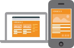
The goal of responsive design is to optimize a website or an email for all types of devices. This can be done for each device separately or by groups of similar screens.
How to make it responsive?
There are many possible ways. We will explain them in the following chapters.
A fluid email is a layout adapted to small and large screens. The content is automatically resized to the device used without bringing any change to the page structure. If your email is already composed in just one column, you can use a fluid email.
To adapt your email to different types of devices, you should set the dimensions of your elements in percentages.
The code to use:
style = "width : 80%; max-width : 600px; height : auto;"
width : image width in percentage for small screens
max-width : maximum image width for larger screens and computers
height : automated height to maintain image proportion
Beware: max-width and min-width aren’t compatible on Outlook 2007,2010 and 2013.
Media queries are instrumental when it comes to adapting your email content for mobile devices. Its CSS3 feature allows you to identify the device width and accordingly apply a different content.
This widely used method consists of targeting the CSS pixel size of the screen:
Code to use:
@media only screen and (max-device-width : 480px)
In this example, we have set the limit to 480 pixels. This means that emails opened on mobiles with a width inferior to 480 CSS px will display an optimised version.
Media queries offer multiple combinations. Here are 2 possibilities to keep in mind:
Selection based on the orientation of the device (portrait or landscape)
Example :
@media(max-device-width : 480px) and (orientation :portrait) {
/* width inferior to 480px and mobile in portrait*/
}
Selection based on the screen resolution or pixel ratio
Example :
@media (min-device-pixel-ratio: 1.5) {
/* screen superior to 144dpi*/
}
Here is an overview of different smartphones in the market (in bold are the most sold mobiles in September 2014):
The smartphone’s width in CSS pixel matches the 3rd column.
Media queries have been tested on:
Default application on
Android 2.3
Android 5
BlackBerry 9930
iPhone 5S avec iOS 7
iPhone 5S avec iOS 8
iPhone 6 avec iOS 8
iPhone 6 Plus avec iOS 8
Gmail App
Android 5
iOS 7
iOS 8
Yahoo App
iOS8
TouchDown App
Android 5
Safari
Gmail
Yahoo
Outlook.com
Compatibility
Compatibility
Compatibility
Compatibility
Compatibility
Depending on the type of operating system, certain rules aren’t taken into consideration like media queries. Test your campaign on your mobile to check that everything works well.
The media queries must be integrated in the
part of the message like the following:<!DOCTYPE HTML>
<html>
<head>
<meta http-equiv="Content-Type" content="text/html;charset=utf8">
<style type="text/css">
@media only screen and (max-device-width : 480px) {
.container{
width: 80% !important;
}
.title-red {
color: #F00 !important;
}
.img-mobile {
width:80%! important;
}
.column{
width:80% !important;
display:block !important;
}
.hide-mobile{
display:none !important;
}
</style>
</head>
Followed by the part <BODY> showing the email’s content
In media queries, indicate how your email should be displayed with special features:
Each CSS class must be introduced in the < BODY > part of the HTML code depending on the elements you want to change. The priority rule !important must be added to the media queries, so the particular style is prioritized to the style indicated in the < BODY >.
Here is an example:
<body style="padding:0; margin:0">
<table class="container" align="center" width="600" border="0" cellspacing="0" cellpadding="0">
<tr>
<td style="padding:15px 0">
<p class="title-red" style="font-family:Arial, Helvetica, sans-serif; color:#000; font-size:30px"><strong>Responsive design</strong></p>
</td>
</tr>
<tr>
<td style="padding-bottom:20px"><img class="img-mobile" src="image.jpg" width="600" height="150"></td>
</tr>
<tr>
<td>
<table class="container" width="600" border="0" cellspacing="0" cellpadding="0">
<tr>
<td class="column" style="line-height:20px">
<p style="font-family:Arial, Helvetica, sans-serif;color:#000; font-size:16px"><strong>title</strong></p>
<p style="font-family:Arial, Helvetica, sans-serif;color:#000; font-size:12px">
Lorem Ipsum is simply a fake text used in the content and layout before the final version.
</td>
<td width="15px" class="hide-mobile"> </td>
<td class="column" style="line-height:20px">
<p style="font-family:Arial, Helvetica, sans-serif; color:#000; font-size:16px"><strong>title</strong></p>
<p style="font-family:Arial, Helvetica, sans-serif; color:#000; font-size:12px">
Lorem Ipsum is simply a fake text used in the content and layout before the final version.
</td>
</tr>
</table>
</td>
</tr>
</table>
</body>
</html>
Mailify Software newsletter
Email marketing created by Mailify agency
With the Mailify EmailBuilder, you create newsletters in a breeze!
Mailify’s revolutionary graphic editor guides you step by step through the creation of a newsletter. All you have to do is to drag and drop the text and/ or image blocks, and your newsletter layout is created in minutes!
With the Mailify EmailBuilder, your newsletter is automatically adapted to be correctly displayed on smartphones. The tool optimizes the graphic creation and allows you to visualize your newsletter on a smartphone in real time.
You can either create a newsletter from scratch, or choose a first base to work on:
Layout created by graphists are also proposed:
Whether it is built from scratch or a layout chosen from Mailify’s template library, each creation is automatically adapted for smartphones:
The email content is created and instantly updated to be responsive on mobiles.
The EmailBuilder is available in the Mailify Software. Download and discover the tool. https://www.mailify.com/free-account?lang=EN
Reading emails on smartphones has become a habit and is firmly entrenched among mobile users. If companies ignore to acknowledge this consumer behavior, their communication by email can suffer serious consequences.
Emails can be made responsive for all devices using the methods presented earlier.
By making responsive emails, you are facilitating email reading on mobiles for your contacts.
As a leading email marketing tool in Europe, Mailify helps companies create and manage their digital marketing campaigns.
Since 2001, the software has been continuously evolving to meet the needs and expectations of users, becoming today an all-in-one marketing tool: Email marketing, SMS marketing, marketing automation, predictive sending, antispam analysis, FormBuilder, advanced statistics, retargeting...
All these functionalities make Mailify Sunrise a complete tool, simple to use and leader in the market.
As a real expert in email marketing, Mailify provides you with advice and best practices through its whitepapers, blog articles and webinars.
The tool has been completely updated and integrates new features allowing companies to easily manage their email marketing.
Mailify allows you to:
Manage your newsletter campaigns locally with the app or online.
Create amazing emails effortlessly.
Automate your marketing just like the major players do.
Showcast your forms with intelligent pop-ins.
See all the performance indicators of your campaigns at a glance.


